Avant Garde Wiki
Blog Post About 1960's/70's Typefaces
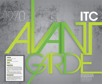
This post makes an interesting point about the ligatures and spacing between the typefaces that came out during the photo-setting era. People where experimenting with alot of different distortions but mainly ended up unreadable, with Avant Garde though it still retains readability which is why I think it would suit my display board.

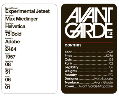
Interesting comparison between Helvetica and Avant Garde I found through google.
I want to use the avant garde typeface for the display board due it being one of my favourites, although I personally find it hard to use ina lot of projects I think it suits the final piece f the project so context wise it will suit the display board, and then I can style the rest of the display board round the typeface.
I wouldn't mind experimenting with what the body/annotative text will be. It could be avant garde for consistency, but maybe I can squeeze something that fits the 70's feel that is also readable like cooper black or something.
More 70's Typefaces
This style below sums up what I originally though I could design the display board as, showing the final product/video in one part and then all the development
around it.

No comments:
Post a Comment