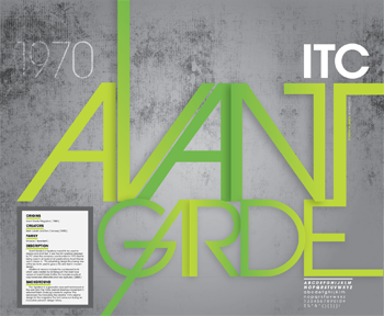
This post makes an interesting point about the ligatures and spacing between the typefaces that came out during the photo-setting era. People where experimenting with alot of different distortions but mainly ended up unreadable, with Avant Garde though it still retains readability which is why I think it would suit my display board.
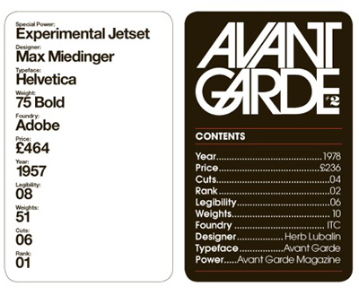
Interesting comparison between Helvetica and Avant Garde I found through google.
I want to use the avant garde typeface for the display board due it being one of my favourites, although I personally find it hard to use ina lot of projects I think it suits the final piece f the project so context wise it will suit the display board, and then I can style the rest of the display board round the typeface.
I wouldn't mind experimenting with what the body/annotative text will be. It could be avant garde for consistency, but maybe I can squeeze something that fits the 70's feel that is also readable like cooper black or something.
This style below sums up what I originally though I could design the display board as, showing the final product/video in one part and then all the development
around it.
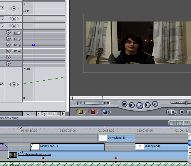
Here is what I came up with from my storyboards. Actually I went in a completely different direction than my storyboards. Had a bit of trouble importing into Final Cut (forgot about no preinstalled MPEG codecs on Macs)
In this interview the subject is in focus and background out of focus so it keeps you paying attention to what the person is saying. It has multiple cameras and cuts when the interviewer asks a question, but for the purposes of this project it is one question that needs to be answered.
Since it is a short question there is no need for cuts to the interviewer either, it is sufficient enough that it can be done in one shot.
In this one it should be noted that close ups are used too show the expressions this could be used in the shot depending on the way the subject expresses themselves.
Another note should be made about the text intros, it could be animated like so or use footage from the interview/out takes to fade into the actual interview/animation.
Ron Paul interview; surprisingly captivating to watch. He may say "uh" alot but thats just nerves coming through rather than him being unsure of what he is going to say. Its easy to come to this conclusion when listening to the way he projects his voice and moves.
Bill Clinton giving a speech to Harvard. A lot can be observed when looking at speeches from famous people such as presidents and talk show hosts. Or even fictional characters.
For my interview project I will be getting peoples early memories and filming them telling this tale. And then animating parts of the story that a`re interesting or cool to animate and cut between the story and the animation.
The animation style itself is the main thing to research for this project as it is a memory I would give preference to a jumpy/jittery style where it is a low frame count, maybe even stop motion-esque depending on the memory.
Although if I set it a bit faster and smoother like a normal animation it will give the short interview/animation a smoother feel and not feel as disjointed between transitions.
One type of animation style I was looking at is from andy sykes who has done short animations for channel 4 and bbc.
This is the zombie poster and tweaked well poster.
The zombie one produced does not seem as funny as it first was, and the design itself is a bit too empty. It is a good concept that could be developed further but based on the first attempt it would be too minimalist and kind of too weird.
The well illustration has been tweaked a bit with so it blends better in the background and the well has been made a bit softer so there isn't' too much focus on it. I also got rid of the 'Jesus' font. Kind of forgot about that; made it taste like a ham and cheese sandwich with too much cheese.
This is a branch off on one of my ideas to have zombies be the contrast to water.
Originally thought of the idea due to halloween and zombies being a symbol of death etc and water being life. Then I remembered this which is also in a previous post.
This is similar illustration; except that its animated in flash. The way it is drawn seems very expressive, this would be a good thing to have in the design as it does give a positive feel to it.
Illustration Research:
This is the style/format that has sprung to mind when deciding to branch out in the water is life idea, with appropriate changes of course.
Type of Illustration is a tough choice to make though. Liberal use of colour for this idea may be a bad idea after looking at this illustration.
One thing that should be noted when doing zombie illustration is that a comic type font should be used as it compliments the illustration well.
This is the first time I will have attempted to illustrate zombies, but from these illustrations it can be seen that it can be done in a minimalist way. For example the eyes in this are drawn in a oval way which looks like it is disorientated/slow etc and then the use of blood. In the other illustrations they seem to have drawn mutilated/decomposing features to promote the fact that its dead, could be a good thing to do for this.